facebook-ads-examples
10 Facebook Ads Examples to Inspire Your Next Campaign in 2026
By
Kinnari Ashar

Some Facebook ads make you stop. Others disappear before you even register the brand name.
The difference often comes down to a small creative decision. A sharper hook. A smarter angle. A product shown in a way that instantly makes sense. Studying strong Facebook ads examples can help you spot those decisions before you build your next campaign.
Ahead, you will see 10 ads from different industries and unpack what each one does particularly well. Not so you can copy the creative, but so you can understand the thinking behind it and turn that into something original for your own audience.
Just remember, an ad you can see publicly is not automatically a profitable one.
Let’s see what these ads can teach you.
10 Facebook Ads Examples Worth Studying in 2026
1. Shopify: “Sell IRL With Just Your Phone” Product Demo Ad
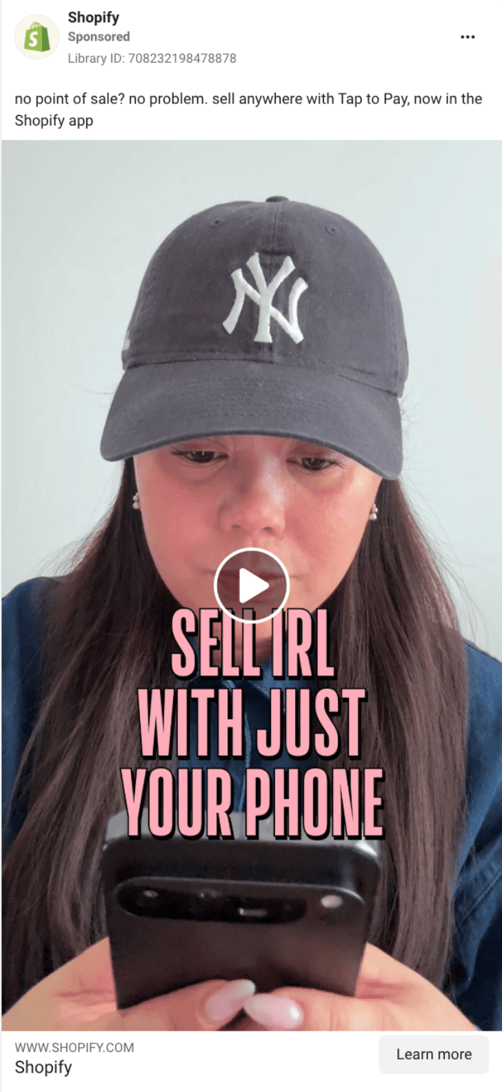
“Sell IRL with just your phone” gets to the outcome before Shopify explains the technology behind it. For a merchant used to card readers and payment terminals, the message also answers an obvious question almost immediately: do I need more hardware?
The creative then proves the claim visually. A creator takes a payment directly on the phone, letting you watch the process instead of relying on feature copy to imagine how it works. The payment confirmation and accompanying audio cue give the demo a clear finish, making a technical product feel surprisingly straightforward.
For SaaS brands, that structure is useful whenever a feature sounds more complicated in words than it looks on screen.
Opening/Hook: Sell in person using only your phone
Angle: Less equipment between you and a completed sale
Proof mechanism: The feature is demonstrated from payment initiation to confirmation
Format: Creator-led product demo
CTA: Explore or start using Shopify’s selling tools
What you can test: Lead with one concrete outcome, then show the shortest possible path from opening the product to getting that result.
2. Spanx: AirEssentials Jumpsuit Fit and Comfort Demo
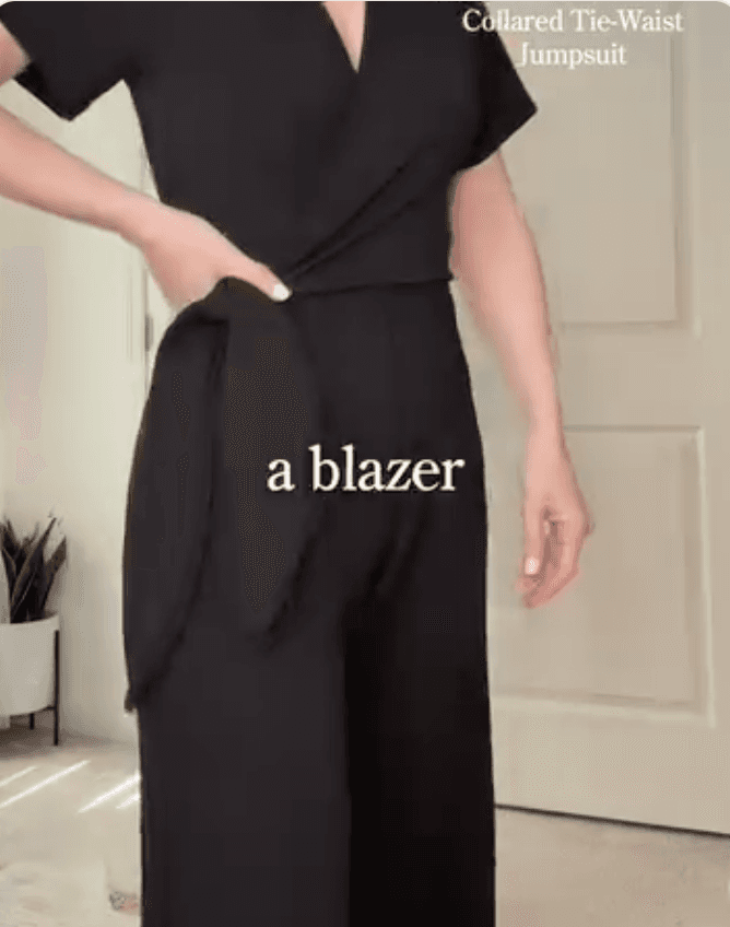
Spanx takes a product that could easily be presented as another jumpsuit and makes the appeal more tangible by showing how it looks and moves on the body.
Instead of relying on phrases like comfortable or flattering, the creative lets you judge the silhouette for yourself. You can see how the waist sits, how the fabric falls, and whether the outfit looks restrictive when the creator moves.
That visual proof matters because fit is difficult to judge from a product page alone. The jumpsuit is also positioned as something you could wear across different parts of the day, which adds another layer to the appeal.
Opening/Hook: The easiest outfit you own
Angle: Style without giving up ease of wear
Proof mechanism: On-body fit and movement
Format: Creator-led fashion demonstration
CTA: Wear this comfy jumpsuit
What you can test: If your product promises comfort or fit, show what that claim looks like during normal movement instead of leaving it in the copy.
3. Poppi: “Soda’s Back, but Better” Category Reframe Ad
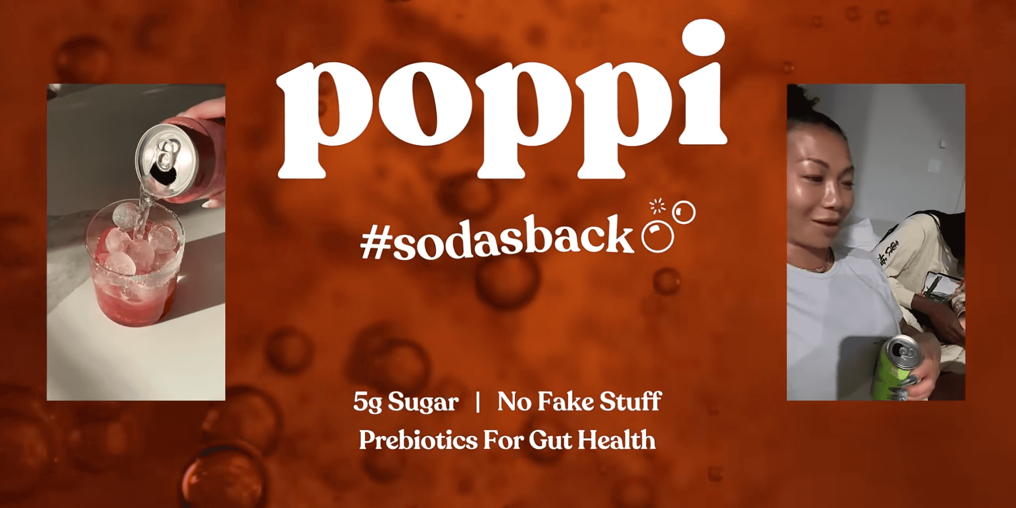
Poppi does not open by explaining ingredients or comparing itself feature by feature with traditional soda. The creative starts with a broader idea: “Soda’s back, but better.”
That framing changes the conversation. Instead of asking viewers to choose between soda brands, Poppi invites them to reconsider what soda can look like in the first place. The product then appears as the answer to that reworked expectation.
The visual treatment supports the message without overcomplicating it. Bright cans, animated bubbles, multiple flavors, and the Circle K offer keep the ad rooted in the familiar soda category while giving it a more modern identity.
Opening/Hook: “Soda’s back, but better”
Angle: Reintroduce soda through a different product proposition
Proof mechanism: Familiar soda cues paired with Poppi’s distinct branding and product range
Format: Short product-focused video ad
CTA: “Find a Store”
What you can test: Identify one assumption people already have about your category, then build a creative that challenges it before introducing your product as the alternative.
4. Liquid Death: “Murder Your Thirst” Concept Reframe Ad

Liquid Death sells water, but the ad behaves nothing like conventional bottled water advertising. Instead of leaning on purity, hydration, or lifestyle imagery, it gives thirst a villain role and turns drinking water into an exaggerated act of destruction.
That contrast is the creative idea. The product itself is simple, so Liquid Death makes personality do the heavy lifting. Aggressive language, dark humor, and heavy metal-inspired branding give an ordinary purchase a distinctive identity. The brand still uses “Murder Your Thirst” across its own website, which shows how central the phrase is to its positioning.
Opening/Hook: “Murder your thirst”
Angle: Turn an everyday hydration need into an over-the-top brand story
Proof mechanism: Strong visual identity and repeated brand language rather than technical product claims
Format: Short video ad
CTA: “Shop now”
What you can test: Look at the advertising conventions your category normally follows and challenge one of them in a way that still feels natural for your brand.
5. AG1: Dietitian Authority and Long-Term Review Ad

AG1 uses outside expertise as the reason to stop and read. The creative highlights a dietitian who tried the product for 12 months, giving the ad more weight than a standard product shot or generic wellness claim.
The long review period also adds useful specificity. Rather than relying on a quick reaction, the ad frames the product through sustained use and a knowledgeable perspective. For supplement shoppers, that can help reduce uncertainty around what the product is, how someone actually uses it, and whether it deserves further consideration.
Opening/Hook: A dietitian tried AG1 for 12 months
Angle: Expert perspective backed by extended product use
Proof mechanism: Dietitian credentials combined with a long-term review
Format: Press style static ad
CTA: No explicit CTA shown in the creative
Unlike a customer testimonial, the persuasive weight comes from perceived subject knowledge rather than personal experience alone. That still does not make every health claim automatically valid. Claims need appropriate evidence regardless of who appears in the ad.
What you can test: If customers need more reassurance before buying, compare an expert-led explanation with a standard product-focused creative.
6. Huel: Founder-Led Nutrition Education Ad
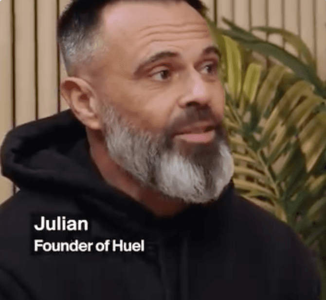
Huel puts its founder into the explanation rather than hiding behind polished brand copy. Julian Hearn discusses where the product fits into everyday eating, especially when preparing a nutritious meal is not convenient.
That makes the founder useful rather than decorative. He is not simply telling you that Huel is great. He is explaining the problem the product was built around and where it sits alongside ordinary food.
The conversational format also makes the education feel less like a corporate presentation. Spencer Matthews brings in a real use case, while Hearn adds the product logic behind it.
Opening/Hook: A conversation about people using Huel as part of their daily meals
Angle: Nutritious food when time makes conventional meal preparation difficult
Proof mechanism: Founder explanation supported by a concrete usage scenario
Format: Podcast-style founder conversation
CTA: No explicit CTA shown in the featured video
What you can test: Take one genuine product decision or customer problem your founder understands deeply and explain why the product was built to address it.
7. Calm: Social Media Overload Problem Recognition Ad
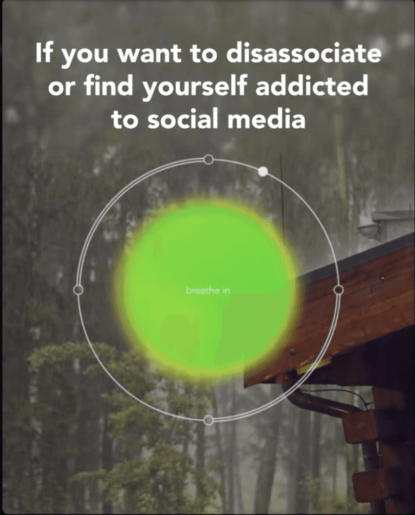
Calm starts with a situation many viewers can recognize: wanting to disconnect or feeling overly attached to social media. The app does not appear as the immediate answer. First, the video interrupts the scrolling experience with a guided breathing moment.
That is a clever choice for an app whose value can be difficult to communicate through screenshots alone. Instead of only promising calm, the creative gives viewers a small taste of the experience through the expanding breathing visual.
By the closing frame, the message moves naturally from experience to action. Calm introduces the app alongside its broader promise of less stress, better sleep, and more mindful living.
Opening/Hook: Wanting to disconnect or feeling addicted to social media
Angle: Interrupt mindless scrolling with a brief mindful moment
Proof mechanism: An actual guided breathing interaction inside the ad
Format: Short experiential video
CTA: “Download this app”
What you can test: If your product delivers an experience, give viewers a small version of that experience inside the ad before asking them to take the next step.
8. Charlotte Tilbury: “Legendary. For A Reason.” Brand Proof Ad
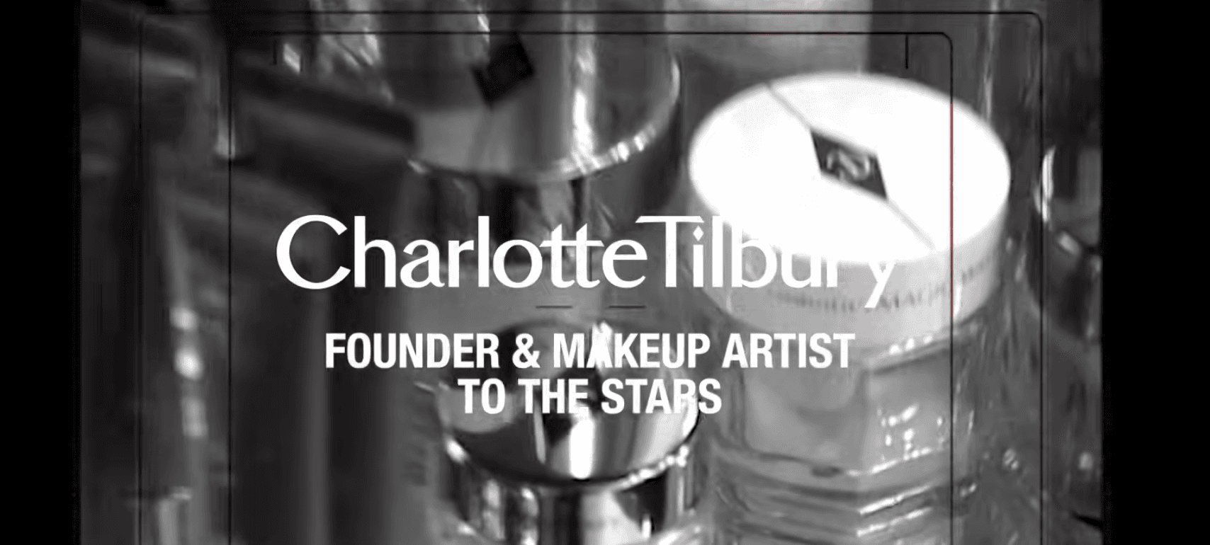
The creative opens with a bold claim: “Legendary. For A Reason.” Rather than selling one product through a quick feature pitch, Charlotte Tilbury uses the campaign to remind viewers that several products have become recognizable parts of the brand’s beauty range.
The proof comes from showing those products in context. Campaign material connects them to Charlotte Tilbury’s makeup artistry, their origin stories, and specific product results. For example, Hollywood Flawless Filter is presented around glow and a filter-like finish, while Contour Wand is tied to creating defined cheekbones.
That gives the ad a different job from a standard product demo. It is reinforcing familiarity and status around products shoppers may already recognize.
Opening/Hook: Legendary. For A Reason.
Angle: Established beauty products presented as proven brand icons
Proof mechanism: Product history, recognizable hero products, and brand-led performance claims
Format: Cinematic brand campaign video
CTA: Legendary for a Reason.
What you can test: If you have products with genuine history or strong recognition, build creative around why customers keep returning to them rather than treating every campaign like a new product introduction.
9. lululemon: “RUN SUMMER” and “FLOW WITH THE GO” Carousel Ad
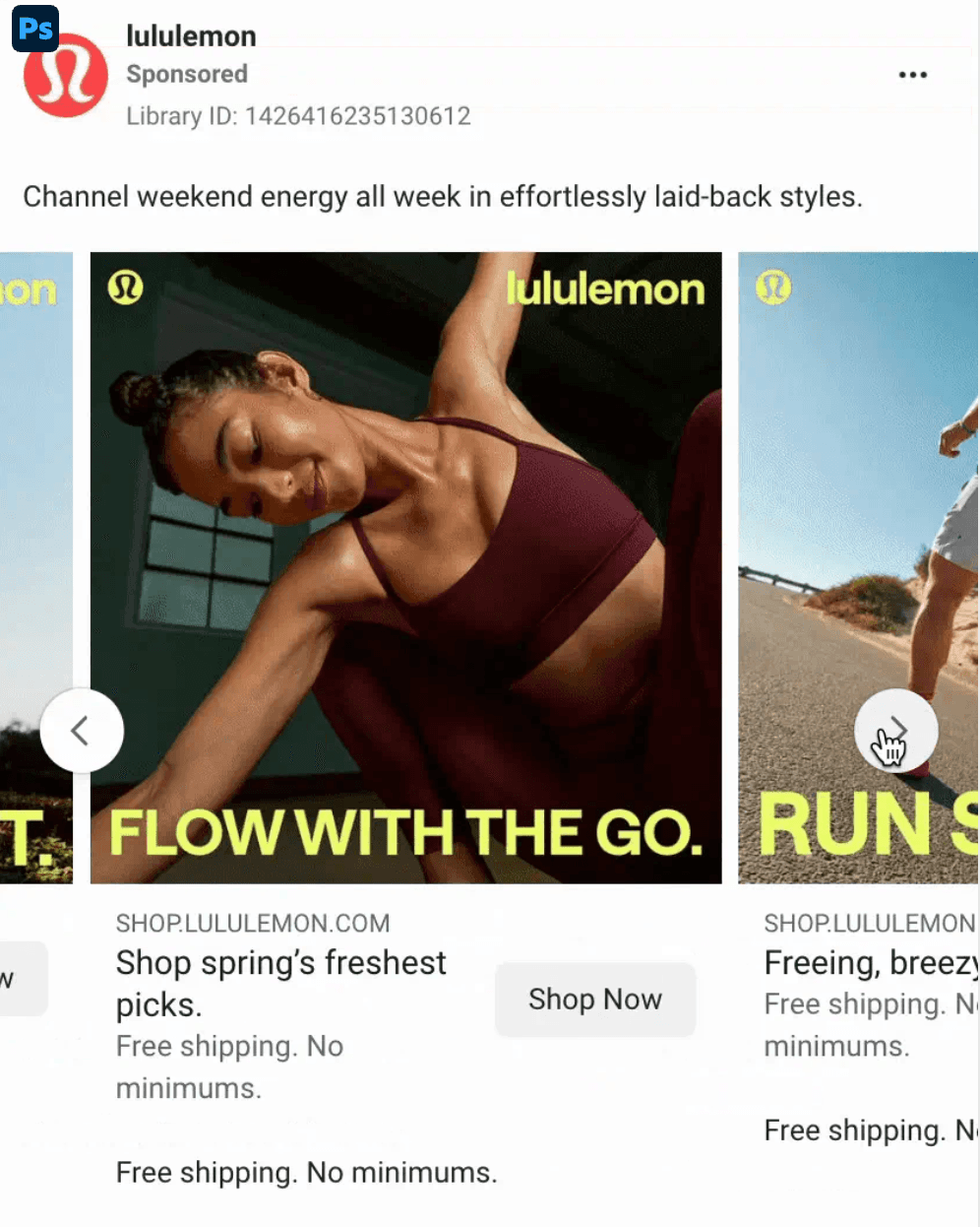
lululemon uses the carousel to separate different activities instead of squeezing several products into one generic shopping message. One card speaks to running with “RUN SUMMER,” while another uses “FLOW WITH THE GO” for a different movement context.
That distinction gives each outfit a reason to exist inside the same ad. You are not simply swiping through inventory. Each card connects the product to a specific way someone might want to move, which makes the carousel useful for shoppers with different interests.
The strong photography and consistent branding keep the cards connected, while Shop Now provides a direct route to purchase. The ad also mentions free shipping with no minimum, removing one possible hesitation before checkout.
Opening/Hook: Activity-specific messages such as “RUN SUMMER”
Angle: Match different products with different movement intentions
Proof mechanism: Product shown in a clear sport or lifestyle context
Format: Facebook carousel
CTA: “Shop Now”
What you can test: Give every carousel card its own use case or customer intention instead of treating the format like a condensed product catalogue.
10. Gymshark: Training Lifestyle Creative
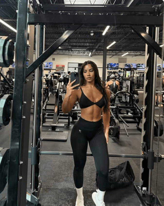
Gymshark places the clothing inside the environment it is made for. The video opens with the athlete showing the outfit, then quickly moves into actual training as she works through different exercises in the gym.
That changes what the viewer is evaluating. You are not only looking at leggings or a top on a static model. You see how the outfit fits into the identity of someone who trains, moves, and spends time in the gym.
The workout setting also gives the apparel context without requiring a long list of specifications. The product remains visible, but the activity carries much of the message.
Opening/Hook: Athlete shown in Gymshark apparel inside a gym
Angle: Connect the clothing with an active training identity
Proof mechanism: Product shown during multiple exercises
Format: Workout montage video
CTA: No explicit CTA shown in the featured creative
What you can test: Show your product inside the activity your customer wants to participate in rather than separating it from the environment where it will actually be used.
What Do These Facebook Ads Examples Have in Common?
These Facebook ads examples do not share one visual formula. Their common ground is strategic, each gives the viewer a clear reason to pay attention and places the product inside a relevant customer context.
Facebook Ad Example | Main Creative Idea | Main Proof or Persuasion Device |
Shopify | Make payment acceptance feel simple | Product demonstration |
Spanx | Position dressing as easier | On body fit and movement |
Poppi | Reframe what soda can be | Category positioning |
Liquid Death | Give a simple category a distinctive identity | Brand voice and concept |
AG1 | Reduce uncertainty around a supplement | Dietitian authority and extended product use |
Huel | Explain where the product fits into everyday eating | Founder education |
Calm | Interrupt scrolling with a sample of the experience | Guided breathing interaction |
Charlotte Tilbury | Reinforce the status of established hero products | Product history and brand recognition |
lululemon | Connect different products with different activities | Use case-based carousel merchandising |
Gymshark | Connect apparel with a training identity | Athlete-led lifestyle demonstration |
The proof changes with the buyer’s uncertainty. Shopify demonstrates function, and AG1 uses authority to reduce doubt.
For competitor research, categorize ads by angle, not just format. Group them by the job they perform, such as overcoming an objection, demonstrating an outcome, building authority, or reframing a category. That makes patterns easier to spot and reveals where your own creative can take a different direction.
How to Analyze Facebook Ad Examples Before Using Them for Inspiration
A useful ad breakdown separates what you can see from what you are assuming. Meta Ad Library can show the advertiser, creative, delivery status, dates, CTA elements, and ad destination, but it does not expose ordinary campaign metrics such as CPA, ROAS, purchases, or profitability.
Element | Question to Ask |
Hook | What is communicated in the first moment? |
Customer | Who appears to be addressed? |
Problem or Desire | What motivation drives the creative? |
Angle | What specific reason to care is being presented? |
Format | Static, video, carousel, Reels, lead ad, etc.? |
Product Introduction | When and how does the product enter? |
Proof | Demo, expert, testimonial, review, transformation, data? |
Offer | Discount, bundle, trial, consultation, standard purchase? |
CTA | What does the advertiser want the viewer to do? |
Landing Page | Does the destination continue the same promise? |
Testable Hypothesis | What idea could you test without copying the execution? |
Treat likely audience, funnel stage, or reasons a brand keeps using a concept as inference, not fact. An old start date can show longevity, but not success.
Where Can You Find More Facebook Ads Examples?
Meta Ad Library is the best free starting point when you already know which competitors or keywords you want to research. Search several advertisers, then compare their creatives instead of studying only the category leader.
Record the start date, format, hook, offer, product, CTA, landing page, and any angles that appear repeatedly. A recurring angle can show that the message matters to the advertiser, but it does not prove profitability.
Meta does not reveal standard commercial advertisers’ exact CPA, ROAS, conversion rate, or profit.
For larger ecommerce research, our WinningHunter Facebook Ad Spy helps you narrow ads using signals such as ad spend, media type, creation date, days running, reach, and Adscore.
You can search a product or niche, compare recurring angles, inspect related stores, and shortlist creatives worth deeper study. Magic AI supports keyword- or image-based competitor discovery, while the Sales Tracker adds another layer of store research.
These signals help prioritize what deserves investigation. They should not be treated as verified advertiser profit.
How to Turn Competitor Facebook Ads Into Original Creative Ideas
Competitor research becomes useful when you separate the creative concept from the way another brand executed it. Copying wording, footage, or visual styling gives you imitation. Extracting the underlying idea gives you something you can adapt.
Take the examples above:
Shopify
Do not copy “Sell IRL with just your phone.”
Extract: unexpectedly simple product use → live demonstration → completed outcome
A software brand could apply the same structure by showing a complicated task completed in only a few steps.Poppi
Do not reproduce “Soda’s back, but better.”
Extract: challenge a category assumption → introduce an alternative → reinforce the new positioning. Poppi’s current Meta creative uses this exact category reframe.
A concept change alters the problem, motivation, story, proof, positioning, objection, or offer.
A variation change alters the wording, thumbnail, creator, background, headline, opening seconds, or CTA.
Testing five new hooks around the same testimonial gives you five variations, not five different creative concepts.
How Should You Test Ideas You Find in Facebook Ads Examples?
Treat competitor ads as hypotheses, not answers. Once you adapt an idea, track the concept alongside the hook, audience, format, offer, spend, clicks, conversions, CPA or CPL, and ROAS where relevant.
Do not pick a winner from CTR alone. A creative can attract cheap clicks from people who never buy, while another with a lower CTR may bring fewer but better qualified visitors.
Meta itself recommends reviewing metrics according to the campaign objective rather than judging performance from a single signal.
There is also no universal testing period or fixed number of creatives. Your budget, target CPA, conversion volume, geography, audience size, product economics, and objective all affect how much data you need.
Turn Facebook Ad Research Into Better Creative Decisions
Strong Facebook ads examples are useful because they reveal how other advertisers frame problems, demonstrate value, build credibility, and position products.
WinningHunter helps you study those patterns without digging through endless screenshots. Facebook Ad Spy lets you filter a larger pool of ecommerce ads, while Magic AI can surface related competitors and products. Sales Tracker and store research add more context around what deserves a closer look.
Use that research to narrow the field, identify recurring creative angles, and decide which ideas are worth adapting to your own product and audience.
Competitor research can tell you what deserves attention. Your campaign data tells you whether the idea actually works.
FAQs
What makes a good Facebook ad?
A good Facebook ad gives the right customer a clear reason to stop, understand the message, and take the next step. Strong creative usually combines a relevant hook, believable proof, a clear offer, and an appropriate CTA. Attention alone does not make an ad commercially successful. Conversion quality, acquisition cost, and customer economics ultimately determine whether the campaign creates value.
What type of Facebook ad performs best?
There is no universal best Facebook ad format. Static images, videos, carousels, and Reels can all work depending on the campaign objective, audience, placement, product, and creative idea. Meta recommends testing different creative approaches rather than assuming one format will always outperform another. The strongest format is the one that communicates your specific message most clearly to your intended customer.
Are static or video Facebook ads better?
Neither format consistently wins across every campaign. Video is useful when movement, product use, or transformation needs to be demonstrated, while static creative can communicate a simple offer quickly. For Reels specifically, Meta reports that native 9:16 video with audio and key messages placed within the safe zone can improve campaign efficiency compared with less native creative.
Do UGC Facebook ads perform better than polished ads?
UGC style ads can work well when the creative relies on personal experience, demonstrations, reviews, or creator credibility. That does not make UGC inherently better than polished brand creative. A weak creator concept can still underperform a strong studio ad. Compare the customer angle, offer, creator fit, proof, and execution rather than treating production style as the deciding factor.
What is creative fatigue in Facebook advertising?
Creative fatigue occurs when repeated exposure makes an audience less responsive to the same ad. Look for a pattern across several signals, such as rising frequency alongside weaker engagement, higher CPA, or declining conversion performance. Meta treats frequency as a variable worth testing, which supports monitoring exposure rather than relying on a universal number at which every ad supposedly becomes fatigued.
How often should Facebook ads be refreshed?
There is no reliable weekly or monthly refresh rule for Facebook ads. A large prospecting audience may respond to one creative much longer than a small retargeting group. Watch frequency, CPA, conversion rate, engagement, and performance against newer concepts. Refresh the creative when those signals show that the existing message is losing effectiveness, not simply because a certain number of days has passed.
Does a long-running Facebook ad mean it works?
A long-running Facebook ad can be worth investigating, but duration does not prove profitability. An advertiser might continue an ad because it supports awareness, retargeting, evergreen messaging, or acceptable results at modest spend. You still cannot see its actual CPA, ROAS, margin, or profit from longevity alone. Treat running time as a research signal, then study the underlying hook, angle, offer, and proof.


We already know what works before you even have the chance to blink!
© 2024 WinningHunter.com